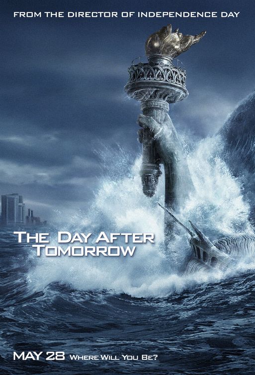
Film posters are used to promote films by drawing in target audiences,
they contain uses of key iconography and this establishes what genre the film
belongs to. By using images and symbolic representations that are traditionally
associated with horror, the poster can appeal to the correct target market.
Film posters communicate through a combination of visual and verbal messages,
which provide clues as to what the film is about. They also embody artistic
value to some people, which explains why so many people collect film posters
and display them on their walls. Film posters take advantage of the fact that
audiences are often attracted to a film simply because of who’s staring in it.
These posters are exhibited in public before the film is released in the cinema
and so people are automatically intrigued by this powerful piece of still
media, wanting to see the film, before they even know what it is about!
Film posters vary, however the most conventionally used is called a
‘teaser’ poster. Similar to teaser trailers, this piece of media is used early
on in the promotion process. Teaser trailers take the ‘less is more’
approach as they simply contain a basic image and perhaps a short, quirky
caption as they avoid exposing too much information. It is common for a few
different posters to be released for one film, some can be classified as
teasers, whereas others contain the names of actors and the film’s title, or
even just showing a range characters. This is done to build up excitement and
anticipation for the film. With the more popular films, such as Scream or
the Twilight Saga, the film poster only needs to contain a few vital elements of its
own iconography and the audience can immediately recognize the film. Different
film posters promoting the same film or series of films will always feature
similar images.


The image will always reflect the narrative of the film and
genre-specific iconography will be used. The image and its background will
cover entire poster and text is conventionally placed over the visual. The main
focal point of poster is always completely visible to the audience. The image
used on the poster must charm the target audience, tempt and fascinate them,
appeal to their tastes and promise to deliver whatever it is they expect to see
from the film. Whether that’s excitement, drama, romance, fight scenes or gore,
so be it!
When looking at a poster, our eyes move from the centre to top to bottom
and horizontally from left to right. In this exact order, we look at the
centre, top centre, top left, top right, bottom left, bottom right.
Conventionally, the title of the film or the tagline (or both) will be placed
in the top centre of the poster and this piece of text will be the first the
audience shall see. They avoid using too much textual information as the
audience usually have little time to acknowledge, stop and read it; also
posters like these are too tiring and difficult to read. The most effective of
film posters contain a quick, punchy, simple and easy to read tagline.
Linguistic devices are conventionally used for film poster taglines,
such as a pun or play on certain words, direct address, rhetorical questions,
short but direct sentences, alliteration, emotive language, repetition, rhyme
and humour. These are all example of devices used in order to create successful
taglines.
No comments:
Post a Comment