Empire is a British film magazine published monthly by Bauer Consumer Media. From the first issue in July 1989, the magazine was edited by Barry McIlheney and published by Emap. Bauer purchased Emap Consumer Media in early 2008. It is the biggest selling film magazine in Britain, consistently outselling its nearest market rival Total Film by over two-to-one and is also published in Australia, Turkey, Russia and Portugal. Empire Magazine is a magazine focussing
exclusively on the release of new films and an in depth look at film culture
and history.The age of most of Empire’s readers are between the ages of 15-44
and most of them are male with 76% so the target audience is people from the age
of 15 – 44 and should have texts, imagery and colours that appeals to the male
stereotypes.
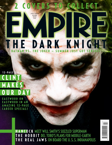
The logo and title of the dark knight and batman on top first than anything
else , implying its the main focus of the magazineThe date and price of the
magazine is in very small fonts which helps make the ‘empire’ and the main film
stand outThese words almost sums up the release or preview of Dark Knight
making it seem big and successful.This also promotes the magazine saying it
cant be read anywhere else.The dark red title of ‘Empire’ highlights the
darkness and the sense of the film and mirrors the title ‘Dark Knight’. Also it
show-cases or give clues about the genre of the film.Bright colours make the
issue stand out and the two colour of purple and green are the Joker’s colours
so already it promotes ‘ The Joker’. Quite subtle yet powerful use of graphics is
used which may suggest that the magazine is unique with its crazy and funky
fonts which looks eroded and very grunge like with paint sprays and scribbles,
looking like its vandalized which also links to the theme of the film and
joker.The word ‘plus’ suggests and highlights the fact that the dark knight is
main focus of the issue and anything else is just extraThe main image is taken
from a scene of the film and it is a very powerful picture which shows the
jokers personality and style already with a particular cunning pose Nature of
vandalism linking to the jokers actions.
face. This denotes the character
itself as the Joker is surrounded by mystery, yet he is never shy to show his
war-paint covered face. His white make up is an attempt to hide his identity,
and successfully does so. The colour white could also connote death, especially
if seen by Asian viewers – as white is the colour of death in countries such as
Japan, where they wear white at a funeral. The lack of background lighting
reinforces the fact there is much about The Joker we have yet to discover. We
see a glimpse of his signature purple suit, also connoting that he is a very
odd individual as it is a rarity for someone to wear a purple suit.
Through an extreme close up we are shown each and every minute detail of his face. These include the wrinkles and scars, telling us how much he has suffered in the past. The Joker’s non-verbal communication depicts a total lunatic. He appears to be smiling, but is clearly not very happy. It’s a very menacing half-smile. This kind of smile is seen by The Joker fairly often, but only when he is either inflicting pain on people, or thinking about inflicting pain. His eyes are wide open with a slightly upwards inflection. This look is very typical of The Joker and once again exemplifies how insane this man truly is. His eyes accompany the infamous half smile very well and are the most Joker-esque features of the overall non-verbal communication. Although deadly serious eyes would never be seen on someone with a smile on their face, The Joker executes the look flawlessly. This is because his smile is far more menacing than any other smile, and his eyes are pure evil. His eyes are clearly on the same wavelength as the smile, possibly hiding a wicked and intricate scheme behind them.
The colour pallet Empire have used for this issue are simply the colours that represent The Joker. This is quite typical of Empire, using the same colour scheme as whatever film character they are.
The masthead title of the magazine ‘Empire’ is a sans serif typeface,
which inclines to give it a lot more impact. This appeals to male audience and
demonstrates the magazine’s upfront in depth look at exiting new movies,
drawing the viewer’s attention into the page and making the title of the
magazine memorable. It’s the iconography of Empire’s font typeface that makes
it easy to recognize an Empire magazine front cover, as its most likely the first
thing the viewers see on the page as its huge , often in red and its
memory-triggery. The fact that the masthead is covered up with the head of the
main image, the character of joker and the title dark knight being before the
masthead highlights its importance and superiority to the title itself.
The strapline reads ‘Meet The Joker’; adding a sense of importance to
the joker as he’s the main subject of the issue reinforced with the word
‘The’.This already has its fan base as the joker is a famous villain in the
batman series and everyone knows him , so this is a subtle way of bringing
insight to the new joker or the villain (which is the topic everyone talks
about when a new Batman movie is coming out). But it delivers the right punchy
line telling the reader everything they need to know in short about the
upcoming feature ‘The Dark Knight’. In addition , the word ‘Meet’ already draws
the readers giving them a sense of being exclusive and informing themselves
about whose the villain.
The main image probably has the most impact, backed up with the
dynamic and serious pose of the Joker – in which he looks very serious, cunning
and evil which already give clues about who the joker is for the people who
doesn’t know and for those who know, has its audience already as they know that
the Joker is evil or cunning. Furthermore, the evil smile and his costumes also
sums up the Joker. Heath
Ledger’s Joker is vastly different from the different Joker we have all grown
accustom to. He is a much darker, far more insane joker than in any other
Batman film. The raw insanity of the joker helped propel The Dark Knight to its
status today. On the front cover we can see the worn out lipstick smeared over
his face, the black circles around his eyes and the famous green hair. However
this Joker’s green hair is far grungier and all these attributes connote the
madness inside his head. The make up symbolizes he is hiding a number of things
from the world. Moreover universally when people see red it tends to be used as
a warning (an obvious example being the red traffic light). The same is true
with The Joker, once people see his bright red lipstick they know they are in
trouble. The
roughly applied lipstick helps add to the utterly insane look. The bright
colouring of the red lipstick is said to connote aggression, anger and fear,
three attributes that The Joker embodies. Finally the black rings around his
eyes emphasize how mysterious and secretive he is, as the colour black connotes
a sense of mystery. . In Western countries black is the colour of death, thus
making him look for more evil and sinister. The pitch black rings on top of the
pale white make up ensure that he is symbolizing death all over the worldBut the way he sits in the middle of the cell implies he
means business, which is ironic linking to his name ‘Joker’.The background of
the cell looks dark and gloomy which reinforces the genre and themes of the
film.
You can tell that Empire is more successful and more superior because the
empire logo takes up almost half of the page whilst this takes up only the top
left corner. Also the
boldness, font and the colours really goes well with the ‘art house’
style.Greyscale or black and white image of Clint Eastwood suggest that it is
aimed at a more older audience and his expression implies that the magazine is
more serious.Also the magazine often has close-ups and medium shots of
characters or stars of films implying its more of a direct approachThe colours
red and yellow matches the colours of the logo and its very subtle unlike
Empire which has mixture of colours.Simple Serif font highlights the magazines
formality and themes
No comments:
Post a Comment