When it came time for deciding whether or not I would opt for a film genre magazine, I looked back upon my target audience profile and came to the cocnlusion that even though my film will be aimed at both genders, I specifically wanted to focus primarily on my male audience as they tend to buy film magazines more. I wanted to create a film mgazine that focused on one sub-genre within horror resulting in a limited edition copy coinciding with the release of my film.
The Masthead
Naming
my magazine required a lot of thought and consideration as I tried to shy away from any of the corny and cliched names that are often associated with the horror genre. I knew from
the beginning that I needed to find a suitable name that reflected the
fact it is a male publication that focuses on horror films in particular.The name also needed to be a reflection of the target audience and their sense of humour.
Film Freak
This was suggested to me by a friend who found the idea of adding freak to describe the readers huge love of horror films. It also has connotations of unusual and disturbing behaviour which compliments the characters minds within horror films.
Premigore
This was a particular favourite of mine as I love the play on the word 'Premiere' which at first was my ideal choice when considering producing a mainstream film magazine. The gore element relates back to the genre and indicates that the magazine will be full of things of an unpleasant nature.
Creeper
Inspiration taken from the film 'Jeepers Creepers', I found this name fun playful and menacing. Readers of the magazine will be find this amusing as they'll be able to have their own nickname and will help them establish a comfortable relationship with it.
The Main Image
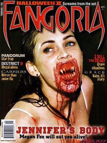
I was quite worried when it came to chosing the main image for my magazine front cover as I didnt want to give too much of the characters identity away, losing the scare factor and mystery for the audience before they have even seen the trailer. I then researched into existing horror magazine covers in order to see how they manage to promote the film and part of its narrative without giving too much away to its readers. I came upon these two covers from the horror movie magazine Fangoria promoting, Terminator Salvation and Jennifer's Body:
Terminator Salvation Cover

Jennifer's Body Cover
I like the idea of just the skull being the main image as it is chilling and ambiguous. Ultimately I want an image which will be iconic and instantly readers will be able to identify the model/image and associate it with the film.
Furthermore, I also am attracted the the idea of using the female protaginst for the cover, inspired by the image of megan fox as her character from the film Jennifer's body. It is unusual for female chracters to be on the cover of horror magazines and this cover satifies the theory that in order for a magazine with a female cover to sell, they must visually satisfying. For example, this cover in particular shows Megan's character as her demon alter ego with the sell line 'Megan Fox will eat you alive!'. With obvious references to her sexual persona, male readers of Fangoria will find this appealing as the focus is more on the actress rather than the character in the film.
The Main Sell-line
I wanted to give the reader of the magazine the first glimpse into my new film and offer them everything from, pictures, how the film was made and produced and else exclusive interviews with the cast and director.
Additional Sell-lines
As my magazine will be a special edition issue, the sell lines will include other popular supernatural horrors that have helped inspire my own trailer.
Colour Scheme
Following the typical convention of horror using dark and bleak tones, to help the magazine stand out from other horror publications, I would like to include zesty and bold colours such as lime green which can be associated an an unpleasant colour and also relates back to the fun nature of my target audience.
.jpg)


